St. Cloud, MN
619 W St. Germain St., Suite 214
St Cloud, MN 56301
(320) 203-4840
Green Bay, WI
520 N Broadway, Suite 270
Green Bay WI, 54303
(920) 884-1496
St. Cloud, MN
619 W St. Germain St., Suite 214
St Cloud, MN 56301
(320) 203-4840
Green Bay, WI
520 N Broadway, Suite 270
Green Bay WI, 54303
(920) 884-1496
A CTA or Call-to-Action is defined by HubSpot as: “...a button or link that you place on your website to drive prospective customers to become leads by filling out a form on a landing page.”
CTAs are typically found on regular content pages. It provides a link to a landing page with a higher value offer, thus channeling the user down the buyer’s journey.
But what makes a CTA stand out? What makes people want to click it? Well, there's a variety of things from the offer, to the placement, to the design. I'm here to help you with design – making a CTA that really stands out and gets those clicks.
Alright, this is what you're here for. To learn how to make a kickass CTA. HubSpot’s CTA tool can be found in your dashboard under Content > Calls-to-Action. This is where you can view your current CTAs as well as create/update existing. And that’s what we’re here to do.
Let's first start by clicking the Create CTA button in the top right. This will bring up a dialog for the creation of a new CTA.
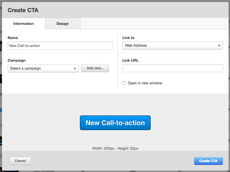
On the information tab pictured above, you can enter a descriptive name for the CTA, add a
The next tab is Design.
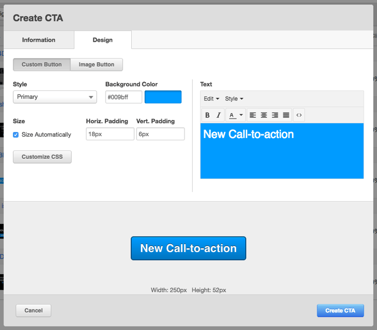
Here you can find tools to customize the CTA. There are two main options here – Custom Button and Image Button. An Image Button is as expected – you upload an image, add some alt text, and that’s pretty much it. The Custom Button is far more advanced. Below it, you can see a few options such as background color, padding, and the rich text editor with its array of options. The button I’d like to dig into is the Customize CSS button.
First things first, let’s go to the Style dropdown and select ‘Link (No Style)’. But, what!? This disables all of the customization options! No worries, we’re going to use CSS to customize the CTA. This will give us far more control than what you see here. So, go ahead, hit that boring old Customize CSS button.
Bam!
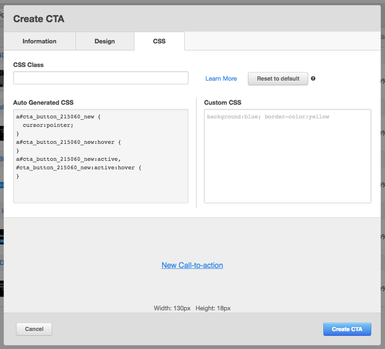
Another tab! Oh man, it’s beginning to look more like my Chrome browser. Don’t fret, this is the last of the tabs and the most glorious of them all. The first thing I like to do is copy the code from the left pane (Auto Generated CSS) and paste it in the right pane (Custom CSS). This will be our boilerplate for the CTA code. I also added a couple lines of code that I always add to this boilerplate – display, white-space and box-sizing.

Now, this playground is all yours. Take that plain jane text link and make it one that can’t help but be clicked. With CSS, the possibilities are endless. Here
a#cta_button_745374_19d8577c-113a-458d-8a59-1970c40a0c4f {
     display: inline-block;
     box-sizing: border-box;
     padding: 15px 30px;
     background: #0099cc;
     border: 2px solid #0099cc;
     color: #fff;
     font-weight: bold;
     text-decoration: none;
     text-transform: uppercase;
     white-space: inherit;
     -webkit-transition: all .2s ease;
     transition: all .2s ease;
 }
 a#cta_button_745374_19d8577c-113a-458d-8a59-1970c40a0c4f:hover {
     background: transparent;
     color: #0099cc;
 }
a#cta_button_745374_0b2aead6-6c47-4146-aea2-be96fcf07b40 {
     display: block;
     box-sizing: border-box;
     padding: 60px;
     background: -webkit-linear-gradient(rgba(0,0,0,.5), rgba(0,0,0,.5)), url('https://cdn2.hubspot.net/hub/745374/hubfs/Stock%20images/people%20in%20bokeh,%20street%20of%20London.jpeg') 50% no-repeat;
     background: linear-gradient(rgba(0,0,0,.5), rgba(0,0,0,.5)), url('https://cdn2.hubspot.net/hub/745374/hubfs/Stock%20images/people%20in%20bokeh,%20street%20of%20London.jpeg') 50% no-repeat;
     background-size: cover;
     text-align: center;
     text-decoration: none;
     white-space: inherit;
 }
 a#cta_button_745374_0b2aead6-6c47-4146-aea2-be96fcf07b40 h2 {
     margin: 0;
     color: #fff;
     font-family: "Century Gothic", CenturyGothic, AppleGothic, sans-serif;
     font-size: 32px;
     font-weight: bold;
     text-transform: uppercase;
 }
 a#cta_button_745374_0b2aead6-6c47-4146-aea2-be96fcf07b40 p {
     margin: 15px 0 30px 0;
     color: #fff;
     font-family: 'Georgia', serif;
     font-size: 18px;
 }
 a#cta_button_745374_0b2aead6-6c47-4146-aea2-be96fcf07b40 button {
     position: relative;
     top: 0;
     display: inline-block;
     padding: 15px 30px;
     background: #43da8d;
     border: 0;
     border-radius: 5px;
     box-shadow: 0 4px #3aa76f;
     color: #fff;
     font-family: "Century Gothic", CenturyGothic, AppleGothic, sans-serif;
     font-size: 18px;
     font-weight: bold;
     text-transform: uppercase;
     white-space: inherit;
     -webkit-transition: all .1s ease;
     transition: all .1s ease;
     -webkit-appearance: none;
 }
 a#cta_button_745374_0b2aead6-6c47-4146-aea2-be96fcf07b40 button:hover {
     top: 2px;
     box-shadow: 0 2px #3aa76f;
     color: #fbfbfb;
     cursor: pointer;
 }
The HubSpot CTA world is your oyster. Now go out there and push the envelope!