St. Cloud, MN
619 W St. Germain St., Suite 214
St Cloud, MN 56301
(320) 203-4840
Green Bay, WI
520 N Broadway, Suite 270
Green Bay WI, 54303
(920) 884-1496
St. Cloud, MN
619 W St. Germain St., Suite 214
St Cloud, MN 56301
(320) 203-4840
Green Bay, WI
520 N Broadway, Suite 270
Green Bay WI, 54303
(920) 884-1496
Call-to-action buttons are the best. Think of them as the rug that ties the marketing room together. If you have no idea what I’m talking about, you should check out this blog I wrote about Calls-To-Action.
The questions here can seem endless: What is a perfect call-to-action? What does it look like? What does it say?
Well, not to rain down despair and confusion on this marketing parade, but there is no perfect CTA.
You heard me. It doesn’t exist.
So now that I’ve blown your marketing world up into a million pieces, let me explain. There is no perfect call-to-action because there is no one way to create a CTA. They change depending on the industry, website design, or goal. What a CTA is created for vastly changes its appearance and language. There are, however, some best practices you can follow to help guide you to your perfect Calls-To-Action.
Design is important, and no, I’m not just saying that because I’m a designer! How you present yourselves digitally often carries as much weight as how you present yourselves in person, especially to a new prospective client. Tom Peters once said, “Design is so critical it should be on the agenda of every meeting in every single department.” I agree. Especially in the marketing department.
So how does design relate to calls-to-action? The biggest and most important piece of advice I can give is to make sure your CTAs contrast. Your CTAs should be built to stand out against your website, or wherever you are featuring the CTA. Do I mean you should use starbursts and comic sans? Uh, no. What I’m saying is that your CTAs should not obstruct the viewer’s ability to find out what they came to your website for, but they should be present and easily identified to offer your viewer a direction to take.
Here are some examples of well designed contrasting CTAs:
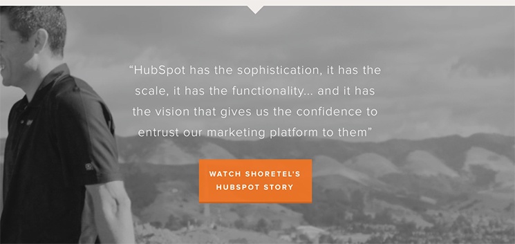
And, because we love HubSpot so much, here is another example from them: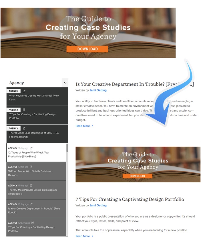
Design is only half the battle. Okay, well technically 1/5 of the battle. Next comes voice. What you say and how you say it will ultimately determine the success of your CTA. The voice must match what the CTA and website look like and how your company actually communicates.
Confused? Let me use Leighton Interactive as an example. We like to be transparent with our people, so we don’t filter ourselves in the same way, for example, as a health care business might. We keep it raw, which means the language we use is very casual and direct.
We could say this: “We believe that business blogging is very important and can have a dramatic effect on your business’s ROI. Download our free Business Blogging ebook to educate yourself on best practices and industry trends.”
Instead, we keep it simple and straightforward, “Get better at business blogging. Blogging works. With this free Business Blogging ebook you can learn the ins and out of effective blogging.”
Another way that language has a dramatic impact on the success of your call-to-action is how it communicates what the user should expect to find if they click through. It is imperative that you clearly articulate the value of what you are offering. Nothing is more disappointing than clicking on a button or link expecting to find something, only to find something else entirely.
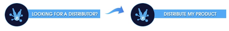
A great example for this would be a CTA we created for one of our clients, Bernick’s. Among many things, Bernick’s supplies and distributes beverages and snacks. On this particular CTA, we wanted businesses to click through if they had a product that they wanted Bernick’s to distribute. The CTA said, “Looking for a distributor?” While the click through rate on the CTA itself was fairly high, the form submission rate was very low. We did a little digging, and realized that many of the viewers thought, “Looking for a distributor?” meant, “Need someone who will distribute products to your business?” (i.e. a supplier). We switched up the wording to, “Distribute my product.” Form submissions improved quite a bit with this change, once the overall message was much clearer.
The last component of language has to do with being honest and specific. There are some words you should stay away from altogether. While you always want to use actionable text in calls-to-action, you have to be careful which words you use. Avoid using words like submit, click here, buy now, and other equally vague terms. Instead, present the value of what you are offering. A good example of this would be, “Download Your Public Relations ebook!” because it is actionable, specific, and tells the reader what they are getting.
Placement is perhaps the most mysterious of the steps. While it is important that the viewer always have the option to "move forward" in their Buyer’s Journey, it is also important that the page content isn’t obstructed by the overuse of CTAs. Try not to overwhelm your audience with CTAs in every other paragraph. A good way to start out would be to place CTAs at the bottom of pages and in the side bar (if you have one). As you continue to test CTAs, you can begin to place them within the content and see how they perform. Remember, you must always test, test, and retest!
When it comes to CTAs, think things through and go with your gut. You are familiar with your business and with a little effort you can come up with the design, voice, value, specificity, and placement of some pretty epic calls-to-action that will help you get the quality leads of your dreams. Sure, you might have to do some testing and make changes to your CTAs, but success is not stagnant. It is never “one and done.” You must be aware of the results and be willing to constantly improve your CTAs based on what the numbers are telling you. Follow this advice -and add a dash of love- and you are sure to come up with your own perfect CTAs.
Want to see the blunders we’ve made with our own CTAs, and how we’ve amped up our CTA game? Check out my last blog, Our Quest To Find An Epic Call-To-Action.