St. Cloud, MN
619 W St. Germain St., Suite 214
St Cloud, MN 56301
(320) 203-4840
Green Bay, WI
520 N Broadway, Suite 270
Green Bay WI, 54303
(920) 884-1496
St. Cloud, MN
619 W St. Germain St., Suite 214
St Cloud, MN 56301
(320) 203-4840
Green Bay, WI
520 N Broadway, Suite 270
Green Bay WI, 54303
(920) 884-1496
In the realm of cinema the poster is a major marketing piece in attempting to tease the would-be viewer’s curiosity to want more so that they will drag their corpse into the theatre seat. In my opinion most do not do it well, and the movie poster designers of today have gotten lazy. We have way too many posters of faces arranged around the title like a Hollywood beheading on display. And the Trajan font is abused more than Linda Blair was in the making of The Exorcist. The illustrated style is rarely used and designers are relying more on star power and grunge brushes than on a creative concept.
This is a tribute to the unique, frightening and classic horror movie posters of our generation. They are works of art with little to no gore. The imagery they feature creates fear and curiosity out of their concept and makes them timeless. Their short headlines tease the viewer about the flick and the typography in the titles act as a logo and have inspired many useless, but fun, free fonts.
So here they are, featured in order from oldest to newest.
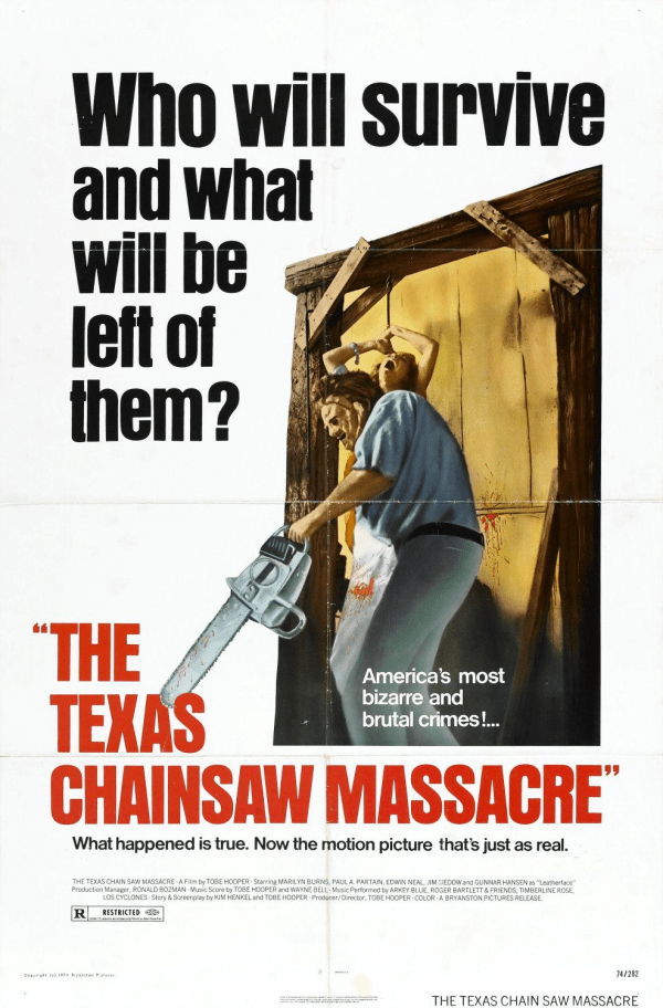
Texas Chainsaw Massacre (1974)
A classic style common to the 60's and 70's films, this illustrated poster pays homage to one of the most disturbing scenes in the film. The stark use of white is a direct contrast to to the filth of the actual film and the composition of the illustration plays nicely into this area, breaking the comfort of the design.
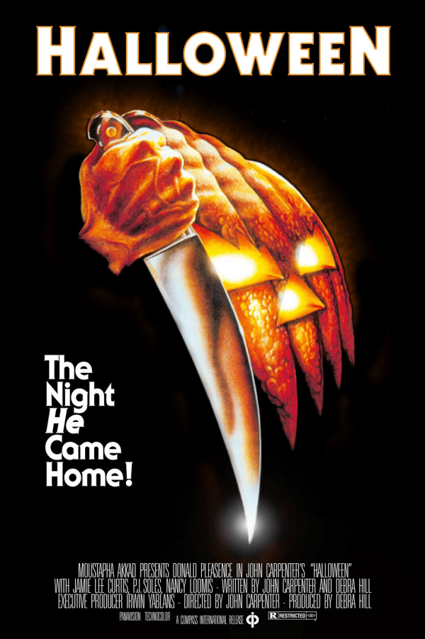
Halloween (1978)
This is the movie that made the butcher knife an iconic horror image and the poster depicts it well. The repetition of the knife shape creating movement while evolving from your standard Halloween icon of the pumpkin, to our new Halloween icon, the butcher knife, creates a memorable image that sticks into the minds of avid horror fans.
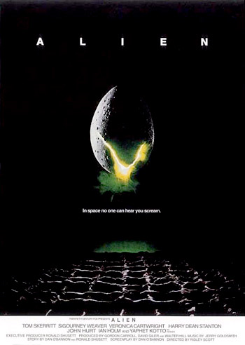
Alien (1979)
Simple and dark, with nothing about the actors or the Alien itself this poster is the ultimate tease for the potential viewer. The typography and whitespace used is fantastic, but you really need to see the opening sequence to appreciate its complexity with the use of tracked out type to create space.
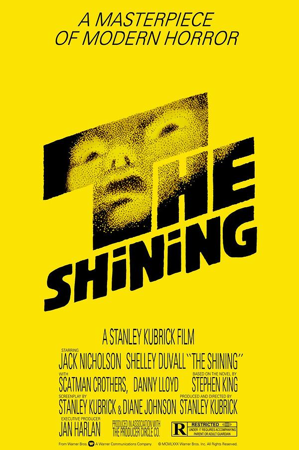
The Shining (1980)
Designed by Saul Bass and although it was not used upon release, has resurfaced due to the cult following the film has inspired. Empty, ghostlike, and simplistic, just like the film.
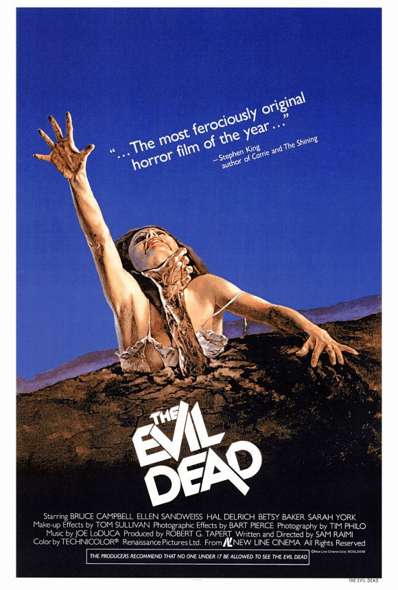
Evil Dead (1981)
Great illustration and great title treatment for one of the greatest horror films of all time. Nuff said.
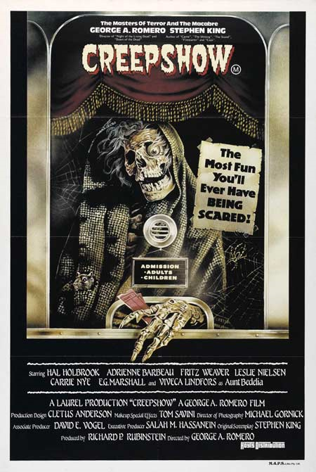
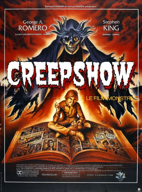
Creepshow (1982)
Buy your tickets from the dead for an evening with their kin. However, I personally prefer the foreign version with more of a colorful illustration and attention to detail in the imagery.
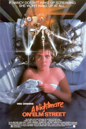
A Nightmare on Elm Street (1984)
A contrasting image of violent and soft themes combining to illustrate the combination of fear and dreams. The fear on our heroin’s face is genuine due to the glove tearing through the foreground with a hint of our villain’s face to capture the theme of this film perfectly.
/Re-Animator_Poster-resized-600.jpg?width=600&height=935&name=Re-Animator_Poster-resized-600.jpg)
Re-Animator (1985)
One of the more literal illustrations in the group, but the scene it depicts is such a driving force in the movie and was such an original idea that why not, right?
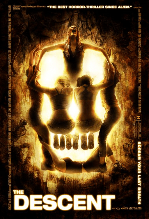
The Descent (2005)
I just love the play off of the form here, signifying the unity of these women coming together as a warning of something sinister to come.
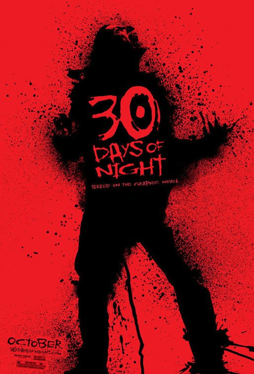
30 Days of Night (2007)
Such a brutal style with a stark, 2-color palette creating dynamic contrast that accurately depicts the ferocity of the film. And you just gotta love the October placement at the bottom.
/file-364265783.jpg?width=600&height=868&name=file-364265783.jpg)
The Cabin in the Woods (2012)
Such an intriguing concept I will forgive the use of Trajan in this one. This puzzling imagery combined with the tag of “You think you know the story” drives the user to find out more. And after finishing the film it will all come together and make sense of this brilliant concept.
So there you have it, some of the best in my opinion. Let me know what you think and what others rival these. I'd love to hear what you think. Stay scared friends.